Wednesday, April 4, 2012

Oppression is always Offensive


Post #2 
The Stone Breakers 


I believe that the reason Gustave Courbet's painting, "The Stone Breakers" is so realistic is because he painted without censoring what the Bourgeoisie class would turn their gaze away from. Bourgeoisie means wealthy or upper middle class people; it basically refers to the kind of people who never have to get their hands dirty to afford their next meal. However, by having so much money in that time period, when so many were suffering and working hard to survive, the  Bourgeoisie people did nothing to help. That may have been why this beautiful painting of two working men making ends meet was so disgracefully revolting for them to look at.  

That would require them to actually look at the suffering souls around them. 

The anonymity of these two men further illustrates their accusatory thoughts as they carried heavy baskets of rocks, or stooped over a pile of even more rocks to hammer away. you cant see their faces, but that doesnt stop the viewer from identifying with them. their clothes are dirty and ragged, torn and worn and yet the men in this picture feel no shame, because they are working their hardest for a chance to bring home some coin and feed their families. I think a similar comparison to a painting such as this in a culture, would be for someone to paint a large picture of a homeless man begging for money on the sidewalk. In reality people usually avoid their glances and keep walking, or even speed up their pace to get away from them. so how would it look for someone to paint this subject matter up close and in your face huge, and then enter it into the Salon next to historical and other popular styles of painting? It probably wouldnt go over too well, I'd imagine anyway. 

This painting had a similar response; although I see it for its simple beauty and talent of artistry, people were threatened and repulsed that an artist would dedicate such a large canvas painting to such lowly subject matter. I also believe that in a way Gustave Courbet elevated these two individuals to a higher level than some of the wealthy aristocratic Bourgeoisie people that had yet to receive a painting portrait of themselves. Could it truly be, that some of these people were so self centered and calloused from the world around them, that they couldnt even appreciate this painting for its simple beauty? the two men are obviously very lavishally painted with beautifully painted creases in their pants and shirts, dirt painted in to make it seem dirty, even the lines on the skin of the older man are insanely replicated and beautiful. But they didnt see any of it. all they saw was poverty and blame being pointed in their direction for it. 

I guess when you look at your own guilt, your eyes are already clouded with repulsion. 

The men in these images cant even look at the viewer, but then again they didnt have to. They were too busy working to turn around and acknowledge the artist and to take the time to have their identities recorded in history. But this is better I think, because it allows the viewer to blame themselves if they had any guilt, and to truly look at the pain and suffering of these people. 

Wednesday, March 7, 2012

Final Winter Week #10 Post #9


A Look Back at What I Enjoyed Most This Quarter 


Two girls dressing a kitten by candlelight

During this quarter, I felt at times lost within all the grand art created during the time periods we looked at. All were fabulous and splendid, but either I had seen them all before too many times, or rather I hadn't seen them, but they didnt interest me much as to how they were created or the background behind them. Aside from that I found a new love for the image of "Giovanni Arnolfini and his Wife" painting, from my introductory post, it was sometimes hard for me to really feel a solid connection to the generations of art, that seemingly sometimes looked the same.
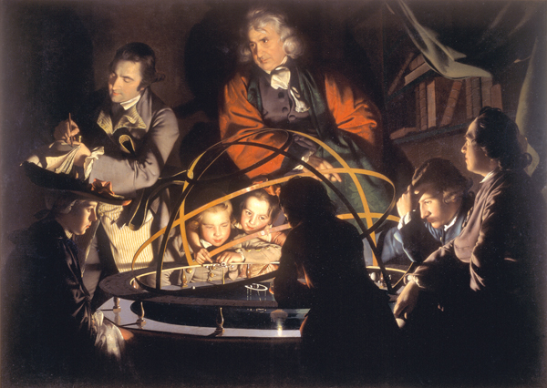
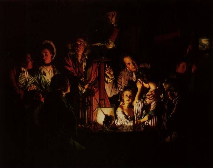
I found however that I was really attracted to art done on a more dramatic scale, such as the single light source images that were created by Joseph Wright of Derby. His images interested me because of how simply he renders these pieces, with the mostly all black backgrounds and only some details on the people's shadowy areas. That, alongside the extreme highlights and softness of the scenes he creates within his paintings are enthralling to me. 

I also found it interesting that he painted a lot of scenes depicting the industrial revolution and being extremely accurate within those paintings. This helped me to picture better where the artist was coming from and to then help me to put together where Joseph Wright of Derby experienced in his lifetime. I've always loved history, and art was a big part of that aspect, but to see works of art and science blended together in harmony fascinated me since I've never been a big fan of science, so thus I sometimes forget how important it is to how we live today. Not only science and art are blended together almost flawlessly but also the visual details that we see of the historical context that is reflected in His works.
A Philosopher Giving a Lecture on the Orrery 
I would one day love to have the ability to create images as dramatic and eye catching as these, but until then I can only learn from what I see. Another thing that I notice with Joseph Wright's work, is that his people are very clear as to what emotion they are experiencing at that moment. They arent stiff and fake like many of the portrait paintings that were shown throughout this class. Because of this, his work reminds me greatly of my favorite artist Norman Rockwell. Who knows? Perhaps he was inspired by  Wright's work as well? That is something interesting to think about.
Experiment on a Bird in an Air Pump
All in all, this quarter was very interesting, and I enjoyed it very much. Its always fun to take a step back from all the fast pace life of the 21st century and find some solitude along with the artists that created these wondrous paintings from long ago, when life was more simple and there were so fewer distractions from the everyday passions.

Thanks for a great quarter Professor Bowen! And to all my classmates who commented on my blog this quarter, Thanks for taking the time and leaving such nice thoughts :D See you all next quarter! 

<3 Kelsee


Wednesday, February 29, 2012

Week 9 Post #8


"At the Light of a Candle, Three Men Study a Small Replica of the Borghese Gladiator"
By Joseph Wright of Derby

For my post this week I decided to go with a work by Joseph Wright of Derby, because I find his work with light to be beautiful and in a way even magical. I found this painting on the Artstoc website and discovered that its not very well known by google's standards. (Since the only free version picture I could find of this image had the watermark all over it) Because of that fact, it was really hard to find any information on what other people thought of it specifically. However from what I've learned about the artist, he was the leading artist that documented the beginning through the Industrial Revolution. Thus most of his paintings dictate some sort of scientific scene.

For this image however it seems similar and different to the paintings he was famous for painting. (scientific depictions) On the other hand it's still a reflective type painting on the effects of candlelight on subjects from different angles. I think this is one of the main reasons why I'm so drawn to these paintings he does. In most of them, (this one included) you can clearly see where the light source is coming from without actually seeing the flame of the candle. Doing this creates a romantic sort of closeness inviting the viewer into the light. In this painting the three men form a close knit circle around this small statue replica, and behind the first man we can see either a mirror, or a drawing of the statue. Its hard to tell either way... The focus of this image is the statue, even though the man in back with the most light on him is almost directly in the center of the composition. This is easy to determine since everyone in this image is looking so thoughtfully at the statue, its hard for us as an audience to do anything but the same.

I also really love how the artist paints the reflective surface of the candle holder and the table. Both of these parts take on their own life, and seem to be the brightest parts of the entire painting. Joseph Wright of Derby does his shadows and highlights so magnificently its hard to imagine that this is something created with paint and a paint brush. The naturalism and attention to details in his work are simply stunning and help to illustrate this scene in such a way that we feel we are invited to join in on the discussion of science, or in this case, art.

Its also really hard to see in this image, but if you lower the color and contrast a bit (or own a poor quality laptop screen) its easy to see the background further than the darkness reflected at first glance. there is a door, and a darker shadow of the man in the center cast onto the back wall. Above them all (I found this interesting) is an unlit lantern of some sort. Most likely one that was used to light the entire room. This is confusing to me as to what the purpose of using such a tiny candle would be, when right above them was a lantern that could provide so much more light on its own than the candle.  I find it makes you think more about the people as they were back then. I can only assume that oil was more expensive than candles, and by using the candle instead of the lantern it gives a sense of secrecy to the image as well. As if the topic they met to discuss was something secretive or private that could not be discussed near the ears of others.

I also find it interesting that even though the artist was so obviously there, he is not there at the same time. The people in his paintings seem oblivious to his over looking gaze and painting. Almost like a stalker unseen in the night, he paints these scenes that block us from seeing the entire picture. Why else would the man in the foreground's back be turned to us, as if denying our existence? If only there was a way to go back into time and ask them, or Joseph Wright of Derby what was the importance of their meeting and why it seems so secretive and inviting at the same time.


Wednesday, February 22, 2012

Week 8 Post #7

Option #1
Bernini's "David"
vs
Michelangelo's "David"


For this blog, I decided to choose option 1 of the two given; because I find Michelangelo's "David" to be lovely, and I was curious to go into more visual details when comparing it to another version of "David". Even just looking at these two statues side by side with no idea of art and how art history works, its easy to tell the differences. These are two entirely different statues taking a view of David and interpreting it how they feel it should be interpreted. However there are other reasons why these statues are more similar and different in art history terms rather than citizen terms. 


To begin with, Bernini's "David" is depicted as being in action. He literally looks as if he is about to leap into battle with his sling and rock. His face isn't idealized with a serene look such as in Michelangelo's "David" but instead is contorted into a fierce grimace reflecting his inner battle as well as facing the battle before him. The lines created in this statue are very diagonal, and dynamic. It's using the contrapose to its thinnest definition, since it almost seems as if he is about to fall into us off of his little ledge. I also find it interesting that Bernini used himself as the figure for the battling "David" instead of doing it from an idealized depiction of what Bernini thought "David" should have looked like. In this way, we get a more accurate and relate-able image that welcomes us to imagine what David was really like instead of having his name seem unreal with an accomplishment available to normal everyday men and women. I also find his piece of fabric humorous and love how it "accidentally" fell over his nudity. Thus preserving his modesty while in the heat of battle. His body is very naturalistic as well, his muscles aren't perfect, and he seems like an ordinary man with his appearance.


In comparison, Michelangelo's "David" has no clothing on or really any way to hide the fact that he is nude. Not only is the figure nude, but he is in incredibly good shape. Even now this statue is seen as the most perfect male figure, and may of even had men striving to look like him in the time it came out. Unlike Bernini's "David", Michelangelo's "David" is standing very still with a contrapose as he views something off in the distance with a strange expression. From the side, his expression seems at peace with what is about to happen, or really you wouldn't expect him to be looking at a giant, as the Bible story suggests. He almost appears as if before the battle he stood and posed in a fashion that seems almost egotistical.  I believe also that the more important thing on Michelangelo's mind with this one was humanism while naturalism was on Bernini's mind with his version. 


They both depict a very strong man, standing up for what he believes in. Even though these two statues are obviously different, their base historical pretext is the same. A young man stands up against a giant for what he believes in, and with the strength and power of God, overcomes his foe and saves his people. Both statues emit a feeling of grandeur and suggest that the person depicted was a very important figure.  

Wednesday, February 8, 2012

Week 6 Post#6


Option #1
Albrecht Durer 
Self Portrait 
1500


I chose this painting from Albrecht Durer because not only does it represent a stage in the artists life that is of high enough importance to paint, but because of its peculiar nature in which it is painted. Going through and looking at paintings from this time period, the only one's I've seen of self portraits with a head on view, were ones depicting Christ in one form or another. All other normal self portraits or even just portraits of people commissioned, were of the person in a 3/4 view. thus for this artist to have depicted himself in such a manor could very well have been sacrilegious in nature when it was created. (according to the documentary) 

I find this fascinating that this artist could so easily depict himself in a way that almost appears to be a likeness of Jesus, and yet not get scorned for doing such a thing. especially in that time period! It is shocking to discover that the opposite is the case and instead of getting the cold shoulder, he got more recognition than ever! funny  way to turn the tides if you ask me. On top of all that he was originally blonde? and to have depicted himself with brown hair just to appear more like Christ? Seems rather backwards in my mind. 

Albrecht Durer found out a way to use the printing press to mass market his art, and thus spreading his popularity even more so across the continent. I found it really interesting that he was so famous all over the European Continent rather than just Italy, because of his ability to recreate his images an innumerable amount of times. This is in itself different from what the earlier European Traditions depicted, because they found that putting more time into one image, and making it the best they could was enough to get recognized in the area they were located at. But I think that Albrecht Durer was better deserving of his fame and fortune because of his wit and genious nature to use such a technology to his benefit. 

I like how in this image there is so many fuzzy and furry things. because of this, it looks really comforting in a way. maybe that has to do with its symmeterical nature, or the fact that he has more hair than I do. Im not sure, but I do know that his jacket looks like it would be really warm. All the details on this piece are stunning, from the accuracy of how the fur on the coat would react when touched, to the shine in his eyes and hair. the folds, the hair, everything is depicted with such skill and beauty, its no wonder the painting itself is considered a miracle. And even now, seen as a beautiful work of art even further around the world. 

Wednesday, February 1, 2012

Week 5, Post #5


Option #2 
Which belongs Where?
A look at 2 works from SAM

Leda and the Swan and her children
&
The Origin of the Cornucopia


While it may appear to be easy to pinpoint which work of art is closer to the ideas and themes seen in Mannerism, it may actually be harder to nail it down to a single painting of the two. Both paintings shown have their own unique traits to them that appear to be influenced by the mannuristic ideals. In The Orgin of the Cornucopia its easier to see this influence because its more obviously laid out for the viewer than it is in Leda and the Swan and her Children.


For example, the layout is confusing and crowded for the composition size, the character's heads are small in comparison to their elongated bodies, and they seem awkward with how they are sitting and moving within the frame. The three characters in the forefront of the image seem massively unnatural; and how they're sitting just seems wrong. Each character in this painting has their body contorted in such a way that it seems as if they may fall over, and to be honest kind of makes me feel uncomfortable. The thighs and arms of the person in blue are almost bigger than their head, and it seems as if the same may be true for the woman in yellow as well. This is what Professor Bowen said in her lecture about one of the main traits of Mannerism so thus this painting must have strong influences from there.

However, I mentioned earlier that I believed there to be some influences of mannerism in Leda and the Swan and her Children  as well as The Origin of the Cornucopia. Its not as obvious with the framing on this one, if it would be truly tight enough to be to that level of cramped compositions... however we can clearly see it within her leg that seems to go on forever; with her knee almost touching the bottom of the canvas before it drops down off the picture. the width of her thighs is also unnatural, and although her head isn't anatomically smaller than it should be, her legs are definitively too big for her body. The way the babies are sitting and interacting with her also seems dangerous; especially the one that appears to almost whisper something into her ear. That and also this image gives off a sense of eroticism from the way the swan almost kisses her cheek and seems to step into the space of the Naked Leda's body.  

So in conclusion, it appears to me as if both of the images provided for this option have some sort of influence from the mannerism style. what with the way the artist cramps the figures into the small canvas space, the way the bodies are contorted in unnatural poses and seem way too big for their heads. But overall if I had to choose an image that I believed was a better example from this artistic time period, i would have to say The Origin of the Cornucopia displayed this style more accurately than the other.