Andy Warhol
Endangered Artist
 |
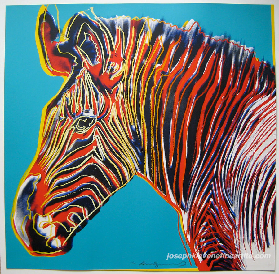
| Andy Warhol Endangered Species: Grevy's Zebra 1983 |
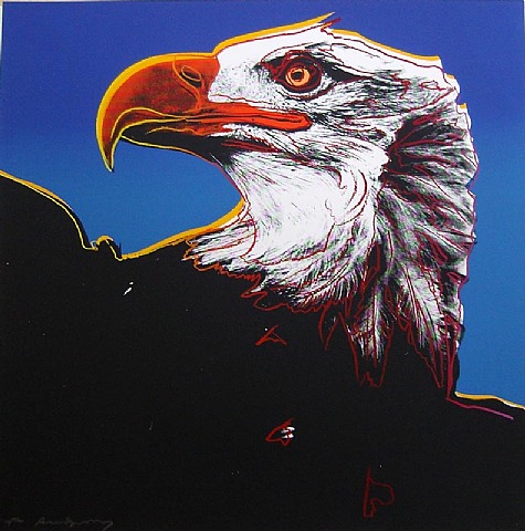
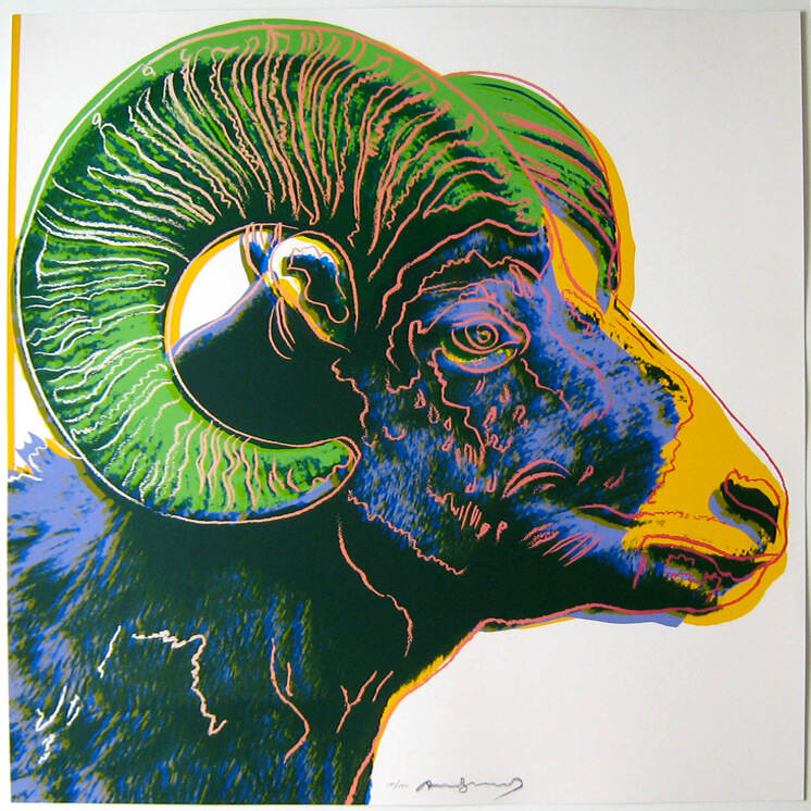
Andy Warhol has been known for many famous images such as his Campbell soup prints, Marilyn Monroe, and his disaster series. But even after researching Warhol himself, his series on endangered species never came to my attention until after I began searching through artstor for an interesting Warhol that I'd never seen before. I was shocked to discover that he's done 10 different animals for this series, which were to help conserve endangered animals, and to get attention to the fact that they are scarce in the wild and that we are the only ones that can do anything. I've included the ten other prints, just because I find them more interesting together than they would be on their own, however I am focusing on the Grevy's Zebra piece for this paper.

This series on endangered animals began from a discussion Andy Warhol had with Ronald and Frayda Feldman about deteriorating coastlines and animals that were endangered. Some of the animals on this list (such as the bald eagle and the pine barrons tree frog) were taken off this list, so Warhol may have made a difference with that, however one of the animals on this list has completely died out... The black rhino.

This image is interesting to me because Andy Warhol took a famous image of a Grevy's Zebra and then overlayed it with color and lines. these bright color spots and elegant lines that follow the image's curves are very beautiful to me because it really makes the animal beneath it stand out. Which in the long run is what Warhol wanted, to get peoples attention about these endangered animals. And he was able to do it in a way that allowed him to stay within his pop art.
Andy warhol was a very secretive person, he told the media very little and wanted to give the cool impression that he didnt care about much; as to keep his private life his own. This is also the reason why alot of his art doesnt seem to mean much at first glance. If someone didnt know this zebra image was done by Andy Warhol, would they have stopped and truly looked at it? I would. But if it wasnt known that it was an Andy Warhol (when he was still alive and had his secrets) would people have read more into these images without the context of Andy Warhol's "No reason" artwork? Would people notice the way the animal's eyes stare into you, pleading against their fate? Or would they be hung right next to the soup cans, passed by for a more famous Andy Warhol work?
 This series has to be my favorite by Andy Warhol, because of the bright use of color, bold use of line and just the overall depiction of how the animals fill the page make it hard to look away. In a way, its meaning behind it and the reason it was created makes it that much more important in my eyes. I think that because of the meaning behind these specific animals (some more so then than now) helps to make them really look at you, instead of just being on a canvas in a gallery, soulless and gathering dust.
  I Love the use of contrasting colors in Grevy's Zebra, the light blue background resognates with the orange, yellows and reds within the stripes of the zebra. These colors help to emphasize and attract the eye, and the interesting use of line keeps the eye within the image itself. I also find it interesting how you can still see part of the original black and white image of the zebra. Almost as if Warhol wanted to leave a remnant of the real zebra underneath the bright neon colors that can detract from the overall sadness behind this image. I like how he immortalized these animals in pop art culture, so that they will never be forgotten, especially if nothing can be done for them.
And yet again I feel as if these animals mean so much more because of the reason and intent that went into creating them. The fact that a small version of the Grevy's Zebra has a price tag estimated around 40-50,000$ is enough to say that people noticed this series, and perhaps he was able to get something done for them.
 Also something in this image that I find interesting, is how the zebra is balanced within the square format. the body of it comes out of the bottom right of the image, but he balanced out the image by adding the yellow line of the ear outside of the image. this helps to pull your eye back into the piece and to keep it traveling around the page with the stripes and organic lines keeping the interest within the image.
 Information found at:
http://www.carnegiemnh.org/press/11-oct-dec/112111warhol.htm
&
http://www.warhols.com/endangeredspecies.html


It's interesting to think about these images in the context of Warhol's other work. Instead of the mass-produced Campbell's soup cans (which are repeated over and over), Warhol just focuses on one single animal in each image. And this obviously makes sense, too. In the Campbell's soup images, Warhol wants to give the suggestion of prosperity, plenty, and commerce. With these images of endangered animals, though, Warhol is bringing attention to the fact that these animals are scarce by focusing on one creature at a time.
ReplyDelete-Prof. Bowen
I really liked how you didn't just focus on one piece, but a collection as a whole. The animals are so unique, each painting gives a sense of life, yet contrasting with the idea of abstract artwork. Like you mentioned before, this really doesn't strike me as an Andy Warhol type of artwork- but it fits.
ReplyDelete