Wednesday, November 30, 2011

Post #9

End of the quarter, a look back on what I learned. 
Post #9 


I enjoyed all of the art we went over this quarter, albeit I admit, it was more interesting when we got to the ancient Egypt and ancient roman art; but I'm biased anyway when it comes to those genres of history. It was also fascinating because around the same time that we were getting into the ancient Greek and ancient Roman art periods, my big sister actually went on a cruise throughout Europe and took a ton of pictures of the things that we were looking at. Such as the Pantheon, and the Parthenon, the Colosseum; she got a ton of pictures of things we didn't go over as well, such as the Sistine chapel, the leaning tower of Pisa, and many others that she couldn't tell me exactly what they were since she had forgotten.but that's another story, and I hope to go over them next quarter.

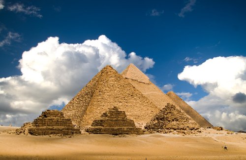
The depth of the emotions in some of the art pieces we went over, especially the ultra realistic marble statues struck a chord in my soul and I truly felt connected to. I think i was drawn to these periods in history, because its around the same time that Christianity came into being; and its always interesting to see and think about the world before it was now. Some of the creations that ancient civilizations came up with in that time period are astounding even today; some even stump architects today on how they were able to create them. (the Pyramids) I hold intelligence to a higher standard than most, and I always find it amusing to seriously contemplate how things were created and built; along with the minds that created them. I also loved how even though I thought I knew a lot about ancient Egyptian culture, and history, I didn't know that the pyramids used to be white with a golden tip. That was the most awe inspiring thing I learned about a culture that I find fascinating. And it will be a piece of knowledge that I can share with many people I talk to about such wonders.


The image of the pyramids of Giza in the morning light, shining with such purity and grace... I cant even begin to describe how awe inspired this image makes me. It also makes me want to go out into the world and see works of amazement in all the cultures... I want to see it all. I think that will be one of my life's goals to do before I settle down into the simple life I want in the future. I would love to see the other structures that the ancient Egyptians were able to create as well as the art and ruins they left behind. There is something fascinating about the same art style surviving and being popular for thousands of years that confuses me. were there no artists who thought outside the 3000 year old box during that time period? if there were, how were they treated in that society? fascinating, fascinating stuff.


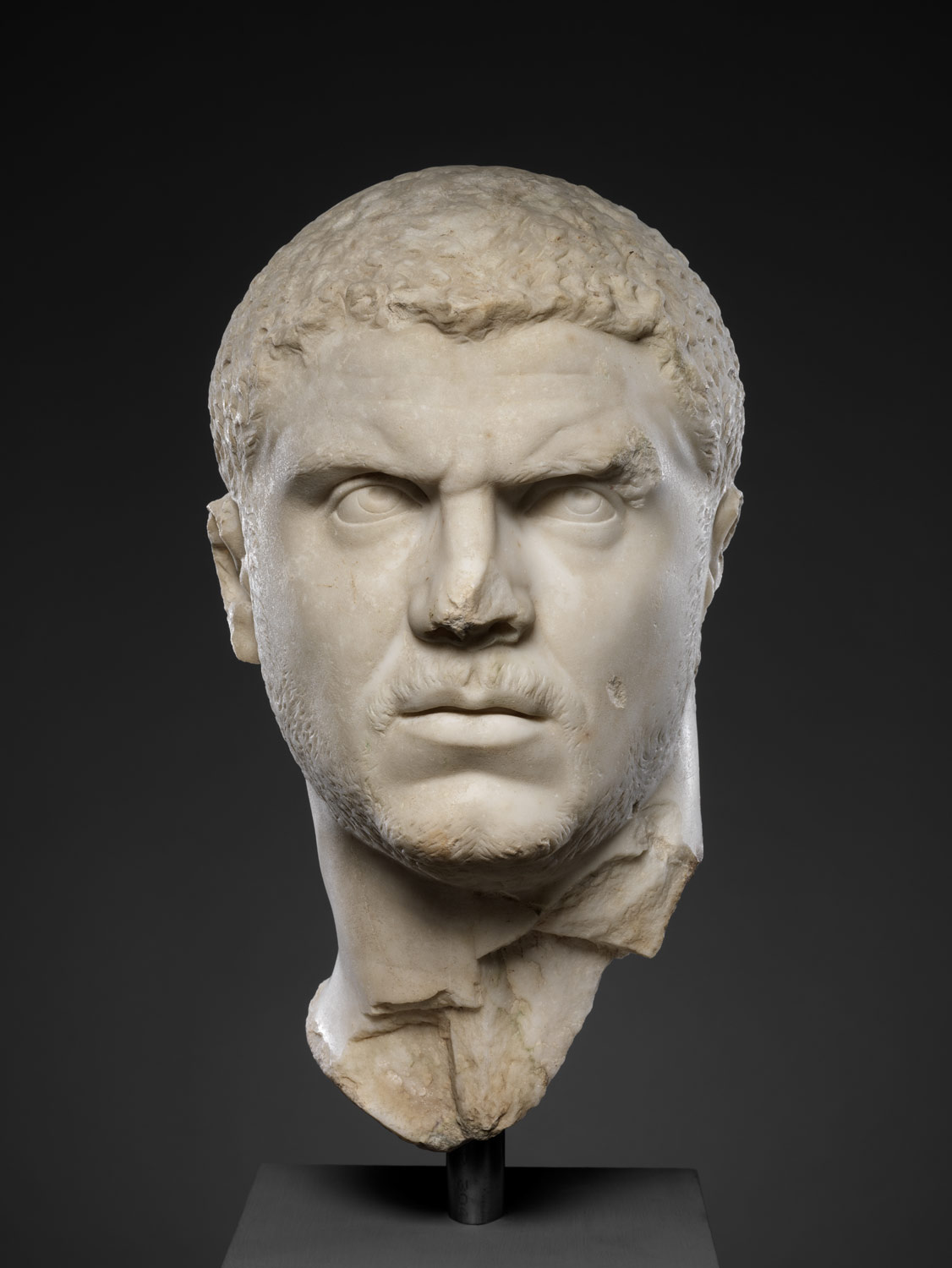
Another piece that inspired me to take another look at art and re-evaluate where my art is taking me is this one, the Portrait head of Caracalla. even though it is partially destroyed, we still get a sense of what the artist was going for, with the raw emotion that he displays plainly on his face. I find this refreshing since I've been dealing with lack of emotion in my art, or rather a fear of painting anything with a realistic expressionism to it. The Romans never shy away from displaying such emotions plainly in their art, and that inspires me to care less as to the feelings of my audience and instead paint what comes from my soul. So thank you ancient Romans! Its too bad your society ended up getting so corrupted it destroyed itself! :-D


Wednesday, November 16, 2011

Week 9 Post #8


Option #2 
Compare and contrast 

Fall of Adam and Eve- The crucifixion of Christ
(Third panel down from the top)


I chose to compare the Fall of Adam and Eve with the Crucifixion of Christ, because these two happenings are not only common knowledge for Christians, but also common knowledge of everyone who has access to civilization. These two images relate to one another more than they differ, as they both share a common theme of change in the Bible.

For example, in the first example we see a depiction of the story of Adam and Eve, which is entirely straight forward. Along with this imagery we can imagine instantly the full story, of Eve being tempted by Satan in the form of a snake, to disobey God and eat from the forbidden fruit tree which would make man like God, with the knowledge of God. This is why Eve is covering herself while offering the fruit to Adam. Since the fruit made her realize she was naked, and thus ashamed of herself. This story is the starting point of man, or rather, the starting point of sin on earth. This is why there is sin in the world today.

In comparison, the story of the crucifixion of Christ is another important story of the Bible; not only because the Son of God came to earth to save us, but because of the erasing of the sin inside of us when we believe in Him, and accept Him. This is an extremely important aspect of the bible because the entire human race was changed the day He rose again. Not only because it introduced Christianity to the world, but because it saved us from sin. Thus in a way, it is the end of sin; not because sin no longer existed after the crucifixion of Christ, but because of the ability to rid ourselves of sin without having to sacrifice something in place of the sin that we commit. Instead Jesus did that for us-which is depicted here.

Both of these images represent something truly important, so it focuses on both aspects without many other distracting details or frills. Jesus is in the direct center on the right, and he is the biggest and most prominent person on that square. Whereas on the left scene of Adam and Eve, the apple is in the center, and even though there are two people in this image, your eye goes directly to that apple. It represents Sin, and because of that, is the most important thing in this image.  The arms of the figures help the eye to follow the apple to Adam, and then back around to Eve in a full rotation of the composition. Looking back on the crucifixion of Christ, there are four figures around Jesus. A guard on the left, testing his corpse to see if he is truly dead, John the Baptist on the left, another guard offering Jesus some sort of liquid, perhaps vinegar (if memory serves me correctly), and the Virgin Mary on the right.

I was also curious about the placement of these panels, because of their importance to Christianity, why they would not be placed at the top. It’s also interesting to see that there were three panels on the left depicting Adam and eve, even though in our modern outlook, we usually just focus on the fall of Adam and Eve instead of the creation of them. But looking further at this composition it seems relevant to point out that these panels are three down from the top, and in the Bible it is reflected that 3 is an important number; mainly because it represents the Father, the Son, and the Holy Spirit. I’ve grown up being taught about God’s 3 forms as being 3 in 1. It makes me wonder, if this was done purposely or by coincidence, since it seems to fit into that assumption.   

All in all, these scenes depict major changes in the world's history, as well as the Bible. Sin being introduced, and Sin being taken away. Big changes, both relating to sin. I doubt that was a coincidence. 

Wednesday, November 9, 2011

Week 8 Post #7

 Option #1


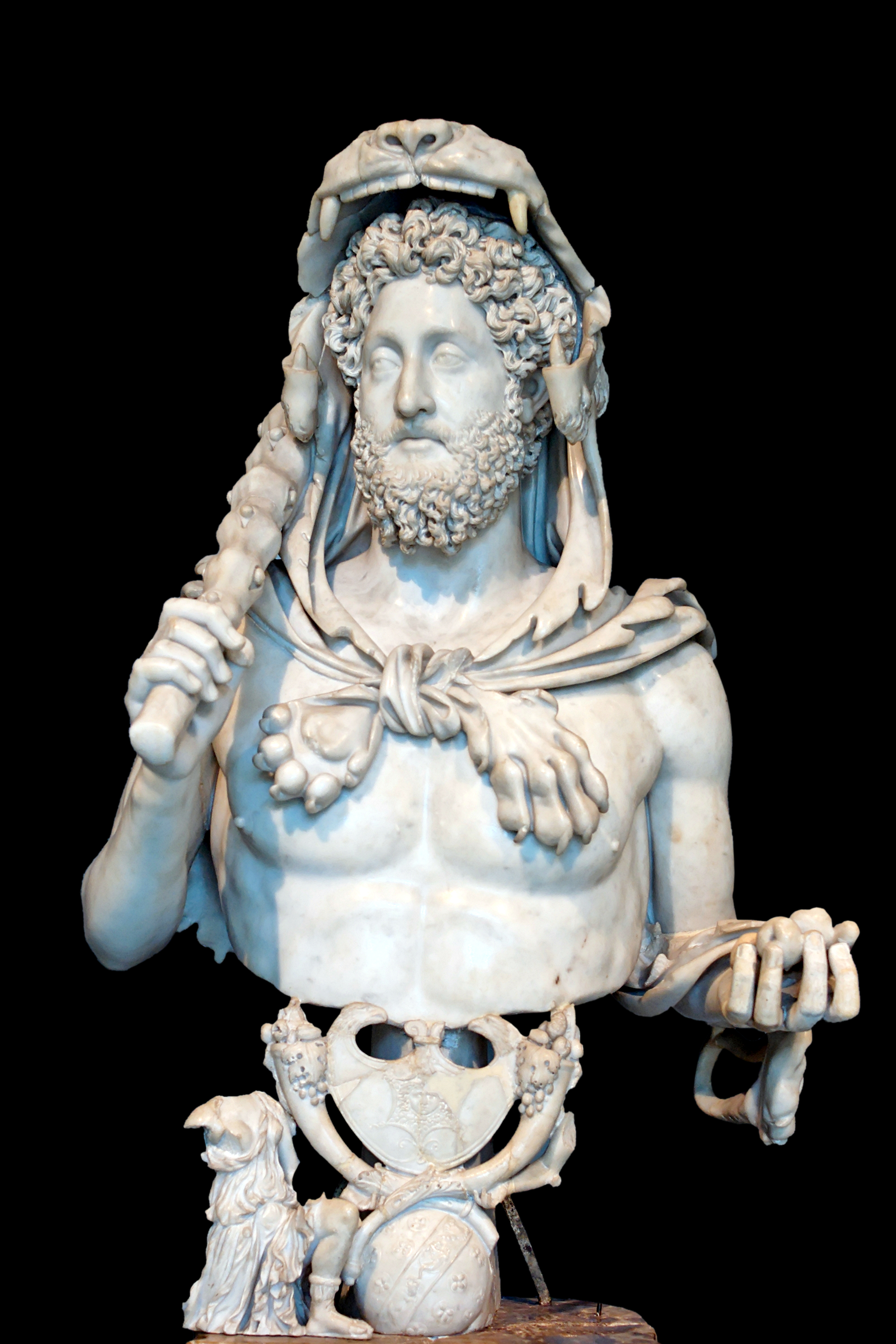
Option #1: Consider the Bust of Commodus as Hercules (c. 191-92 CE) and
the portrait head of Caracalla (c. 217-230) 


            I believe that both statues evoke a feeling of power, and status. however in the case of the Bust of Commodus as Hercules, he seems to be pushing that idea ahead further than the Portrait head of Caracalla, since Commodus is blatantly comparing his image to the god Hercules, and re-creating himself as the hero of so many tales in that era. I believe it would be comparable in modern times if Barack Obama were to fashion himself into the image of Jesus or even Buddha. He is trying so hard to have the people see him as a deity figure, that he'll replicate it in any way he can. Also, the story of Hercules is well known even to this day, as a hero as strong as a God; fighting his way back into the realm of the Gods. (Mount Olympus) However even if I am recalling the story of Hercules from the Disney movie, the point is the symbolism that he was going for when having his bust made in that form is obvious. Strong, courageous, smart, all in all a great ruler. Also this can be seen in the detailing of the lions skin draped over his head and tied around his shoulders, that he was a strong and wise warrior. In order to have concurred such a feared and revered creature of the area. The amount of detail in the curls of his hair and beard are incredible also. It seems to give him a more youthful and immortal feeling than if they had depicted him balding. Which would be too human and too similar to a common man to work to elevate the people's view's of his superiority.
            In the case of the Portrait head of Caracalla, we don't get as much visual triggers as we do in the first bust, since all that's left of it is the head. The face itself is interesting, its realistic, and is serious. Just the features on their own give the impression of unwavering strength and wisdom. He has very strong eyebrows as well as realistic creases from thinking or being threatening, but I sense no threatening substance from his glance. It seems to me as if both statues have a very wide range of audience, as I assume the story of Hercules was as well known in that era as it is in ours. As well as the Portrait, because it holds a certain tone through his expression that I believe can be read by many different people of many different ages. I like the fact that his hair is more realistic, as well as the fact that he has a light beard, would suggest a youthful first growth of hair. Or the merging into puberty but having the rest of the statue symbolize strength and wit. perhaps he was trying to have people see him as young and wise, to help strengthen the confidence of the people he was "advertising" to. Young yet wise, in order to rule Rome for a long time; yet well, so it wouldn't turn to tyranny.    

Wednesday, October 19, 2011

Week #5 Post 5

Agean Art
Option #1


I chose to compare Bull's Head Rhyton from the Minoan culture to The Great Lyre With Bull's Head from the ancient near eastern Arcadian culture in Ur. I believe that they are similar in many more ways than they are different, culturally and physically because of the common symbolism of the Bull displaying power.
            But first, the ways they are different are also important to look at. For example, the Great Lyre's Bull head has a very stylized beard and hair made from lapis lazuli that hangs down far past its chin. However the Bull in the Rhyton form is more realistic in its rendering, and although squiggly lines are still used to form the idea of curly hair on its head and face, it can be more accurately compared to that of a real living bull. Also instead of using fine materials such as the gold, silver, lapis lazuli and Bitumen seen in the Great Lyre, The Bull's head Rhyton only uses a common form of soap stone called Steatite, shells, rock crystal and red jasper.  
            Both Bulls are stylized, one more than the other. For example the Bull's Head Rhyton uses bright blue for its fur, and elegant golden horns that stretch upwards in an elegant swoop. The Bull's head on the Great Lyre is easier to see the cultural background and stylization with the long locks of curling hair for the beard, the large open and outlined eyes, the large ears, and the golden flesh color of the fur and horns. Both cultures used imagery of the bull for its representation of strength, power, and fertility. Also it seems as if both forms of art were used for a religious purpose, or ceremony. Although the Bull's head Rhyton is in itself entirely the bull's head, the Great Lyre seen in the previous culture features the bull's head as only a kind of decoration on the bigger piece. this piece being an insturment including a story element below the head. Because of this we can easily see the cultural birthplace as it were that each piece was born into. In the Minoan culture Rhytons were used frequently in different styles for celebration or religious ritual, and were intended to be carried instead of set on display. Where as the Great Lyre with Bull's Head was born into a culture that was obsessed with religious nuances and story telling through pictures. So both pieces easily reflect their home countries, even though they are decently far away from one another.
            I find it interesting also that both pieces had to have the wooden element of the art restored because they didnt hold up against the daily use and battery of careless hands through the ages, and possibly even because of similar climate difficulties that could have affected the deterioration rate of both items. But all in all, both pieces were held in high reverie, and were used often because of that reason, and used well. For the beauty that each piece still holds to this day is astounding.

Wednesday, October 12, 2011

Week #4

Ancient Egypt & How it Compares. 
Option #1


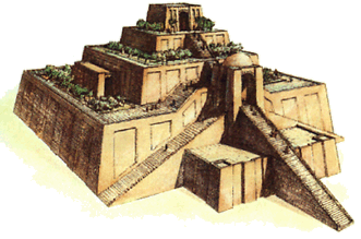
To compare the pyramids at Gizeh and the Ziggurats of the ancient near east, one must look to all aspects of each in order to do it properly. To begin with is the most obvious comparison, the juxtaposition of each structures appearance.
            First, while looking at the Ziggurat in Ur we see a rectangle like structure with 3 sets of stairs all leading to the top where there is a series of smaller rectangles leading up to the top of the structure. However it still mostly retains its rectangular like feeling. Everything on a ziggurat is easily seen and it is massively decorated on the exterior to give of richness and holiness. Also, the ancient people of Ur used the Ziggurats as a means of getting closer to the Gods who were perceived to live on holy mountains. Or places that were very high up. The people of Ur made the Ziggurats to worship as closely to the Gods as possible. The intention of the Ziggurats themselves was to get high enough to reach the Gods, so there was no need to put anything on the inside of the temple. As a forethought, Ziggurats weren't made out of large blocks of stone as the pyramids were, but a much easier element to construct with, and sturdy in its own right, mud bricks. These bricks were made one by one by hand, and then easily transported to the building place. Because they were not that big on their own they were easy to create and didn't take the massive amount of manpower and creativity to move as were the 2.5 ton stones used in the creation of the pyramids.
            Now on the other hand we have the Pyramids at Gizeh, most of their lavish decorations are on the interior tombs within the pyramids and the exterior (as it once was) was a simple white limestone with a golden tip. Where as this can be compared to the purity of the Gods of the time period, and is rather impressive in its own right, it was less a feature of timeless carving and detailing than as an overall structure. Also easily compared are the lack of staircases or any obvious means of entry into the Pyramids. They are perceived as one large structure in which only the Gods and the Ka of the deceased pharaohs could enter. Because of this, the main purpose of the pyramid could be found on the interior, not the exterior of this structure. Another obvious difference is the shape of both figures. The Ziggurat of Ur is very obviously shaped as a series of rectangles converging on top of one another, while the Pyramids are very delicately organized into a perfect rendition of one of the triangle family, a Pyramid. (a four sided 3D triangle)
            While there are many differences between these two structures, there are also some similarities shared between them. They were both perceived as holy places for very important people to visit. They were both very large structures both for their time periods, as well as in general. They both took massive amounts of time to create, and great care and attention to detail on the planning and building. They were both revered by the people of the culture in the area, and finally, they were both created in a time period that only had man made tools and labor to construct the structures.

Wednesday, October 5, 2011

Week #3

Art of the Ancient Near East

Assurnasirpal II Killing Lions
C. 875-860 B.C.


            In this famous Ancient Near Eastern work of art, many aspects of the time period are easily read and presented here. This image represents the power and bravery of the king and helps to make the king seem more important and otherworldly than everyone else in this image. One example would be the anarchical scale (when the most important figure of an art piece is bigger than everyone else in the picture) of the king in comparison to everyone else in the image. if you look at the two soldiers on the left, they are both the same size, even though one stands farther back than the other. however now if you look at the king on the back of the chariot, he is taller than the man behind him. Since the two soldiers are in the same picture and in a similar position as the king and chariot driver, you can just assume that the artist did it for that particular reason.

            Another aspect that is easily seen in this image is the amount of detail put into the king's clothing and the king's horses harnesses. Such fine details to spend countless hours on carving if it didn't have a specific purpose. Also a side note with the horses, usually from what I've learned about the ancient near east, the average amount of horses used to pull charioteers is two. However, in this image, to flaunt his power and ability he has three fine stallions to pull his chariot. Also as Professor Bowen stated in her lecture for ancient near eastern art, she said that Lions in that area of the world aren't as big as what we think of when we think of African lions. Therefore its odd that the lions in this image are almost as big as the horses around them, and seem to be fiercer than even the African lions. Lions were very substantial in the lives of the Assyrian people which made the image of king Assurnasirpal hunting them even more powerful. Lions were considered wild, uncivilized and bothersome in the lives of the people of that time period, thus having the image of the king killing and rising above them that much more powerful, and almost otherworldly.

            Continuing on the same topic of the lions in this low relief carving, the strength of these lions are also very detailed. They have their teeth fully shown, (both the attacking and the dying lion) long and sharp, baring and threatening the king. It's arm and shoulder muscles rippling, and even though its been shot 4 times by a series of the kings arrows, he still stands strong and angry, seemingly giving everything it has to attack the king one last time. However on the comparison the king has a calm looking expression, so calm that if you were to cover up the image of the lion it would almost seem as if he were target shooting with how calm his demeanor is. Calm in the face of adversity is also another strength the king is trying to portray, as a brave king his subjects can expect him to not cower against resisting countries or forces and instead rise up and attack with the calm means necessary to make wise decisions.

            As far as the fact that these images used to be painted bright colors to emphasize the details and really make the image pop against the stone walls, if you were to imagine the colors they used, they would probably be bright warm colors of the king and the lion, and more neutral or cool colors for the soldiers and possibly even the dying lion. I have no idea what colors were actually used, but if what I have guessed is true on the color spectrum, I would not be surprised.

            Finally and possibly most importantly, is the direction of all the people and even the animals in this image. The king is the only one brave enough to turn and face the charging lion, as the charioteer is racing forward and the soldiers are marching the lion closer and closer to the king, it basically implies that he's alone in his battle, and possibly even putting his life on the line to kill the lion. With his powerful muscles bulging he pulls back his bowstring and arrow for the final blow to the head of the lion, point blank. The hardest possible shot to get, because of how close he is to the lion, as well as the lion's desire to kill the king in one fell bite. But then again everything represented in this image is to make the king look superior to any living creature with his bravery and power. In this image alone he asserted himself by slaying two lions. Could they represent neighboring kingdoms? Or even trials he'd overcome in his lifetime?  Only the king and the artist know for sure, its a shame that they're both dust by now.

Wednesday, September 28, 2011

Week Two: Post #2

Prehistoric Art
&
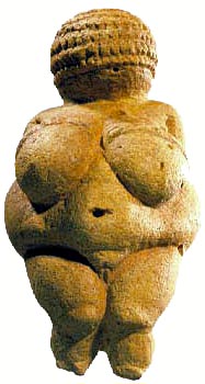
"Venus of Willendorf"


The term "Venus" refers to the many images of Venus through the ages, modest, sensual and sexual. The perfect woman, created to evoke erotic feelings in the male population.  This however, would not explain why such a strangely overweight and immodest female  representation of it would be entitled the same name. Unless of course it was done sarcastically, then of course that would make more sense.
            We may not know much about the artist that created "Venus of Willendorf", or even who they were, male or female... But this little piece of stone, carved so masterfully between 21 and 24,000 B.C. still has quite a story to tell. Why talk about it? Well for one art speaks to us. That's what makes us human. We can identify and relate to it, or wonder for countless hours how it was made, what happened during its lifetime, why it was made, who made it, or even when it was made. But because it was made, we have reason to analyze it, and the artist behind it.
            As a contemporary artist, this sculpture at first slightly shocked me. Not only because it was a blatantly female nude statue from prehistoric times; But because of the body type of the statue. It's so lifelike it demands attention to all the perfect details. However, looking at the possible time period it was created in, it just doesnt make sense that a woman could afford to be that overweight and still survive. The seemingly large form of this statue is so perfectly done, that if seen on her own in a photograph, for example, you would not be able to tell that she could fit in the palm of your hand. Like the article said (http://witcombe.sbc.edu/willendorf/ ) this must have meant that the woman this statue was made in likeness was important enough for other people to take care of her completely; and be created in likeness that's portable enough to go wherever the nomadic people needed to go. Which is evident in the type of rock, and where it was discovered. (Far away from where rock like that comes from) Also just as surprising, it seems as if it was originally supposed to look like it was on its menstrual cycle, so that would lead to assume that it was a female that created it.  This piece of possible information inspires me.
            All in all, aside from the obvious overweight nature of the woman, and the lack of a face, I see this image as beautiful. Not only because of the fine job that the artist did in rendering it so carefully; but because of its simple unashamed nature. The embodiment of a woman, that most people would find repulsive, is simple enough in its existence that seems to me as if she could exist in any era as a work of art. The only reason that most people wouldn't consider this piece to be beautiful in this time period is because it doesn't fit into the harsh standards and strict boundaries that most people associate with the perfect woman in this era. Not only is she not run-model thin, but she doesn't try to hide the fact that she is nude. Because I live in this generation, at first I was a bit put off at the statue, and had a slightly hard time finding it to be beautiful; but my conclusion stands, The "Venus of Willendorf" is in fact beautiful and worthy of the attention that she gets.

Friday, September 23, 2011

Week 1- Introductions

Hello fellow online artists! My name is Kelsee Franz, I am currently a senior at Central Washington University, and an art major. I am 21 years old, and I am also an intern with the DRGN Corporation as a concept artist. I enjoy many different types of art, from photographing, to digital painting, to sketching to sculpting... If it's art, I love it! I am also a writer, and a musician, which keep my brain stimulated and my time occupied. I am looking forward to this quarter and learning about the art of the past, as well as possibly learning new styles and techniques to adapt to my modern day outlook!

Thanks! & Keep your paintbrushes busy!

~Kelsee