Wednesday, April 25, 2012

Modernity


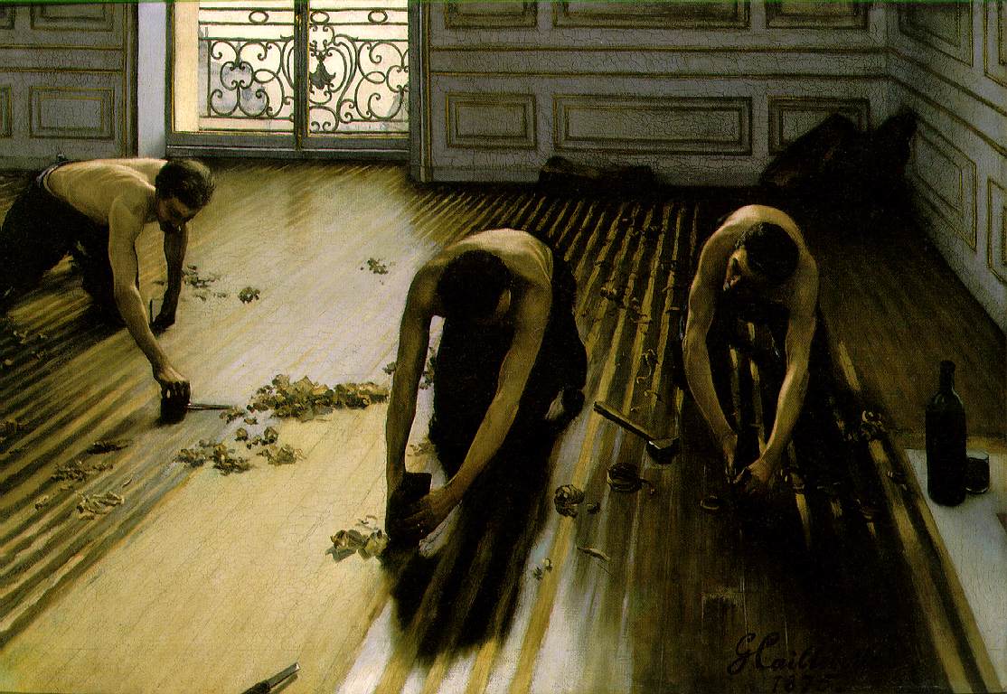
Modernity in Caillebotte's work

 Caillebotte is a prime example of modernity in French culture. He was slightly impressionistic, he painted mostly male figures, and many of his paintings give off the feeling of isolation and loneliness. Looking back at his paintings in our day and age, you wouldn't think that this artist's work would be considered controversial. All in all, his paintings are stunning and are a testimony to France in the late 1800's; and reflect a certain style to them that is so detailed and colorful you can see all sorts of shades in a wall painted cream. 

First off, Caillebotte was slightly impressionistic, meaning he painted with rough brushstrokes and sometimes painted outside, and enjoyed depicting spur of the moment paintings. However his work was usually considered to be too realistic and didn't quite conform to the main objective of impressionistic painters. In my opinion, it seems as if he was inspired by the great impressionistic painters of his day, and then created his own style loosely based on that concept. 

Secondly, Caillebotte painted mostly male models, which to paint male subjects in a common environment. this just wasn't done, and viewers of his art were outraged at a few of his works because of this. especially the painting of the floorscrapers, since this painting depicted poor men working on the floor of a rich person's house. It was almost as bad as painting a prostitute looking at the viewer, and yet again, he offended many people. Not only did he depict mostly clothed men, but his nudes were usually all male as well. The way he painted them gave a voyeuristic appeal, almost as if you had opened the bathroom door, saw what he painted, and as you shut the door as quickly as possible you apologize. It was crude and embarrassing of a sight to see, and he was the first one to do it. His art was even still accepted into shows and such, but it was put in side rooms so that no one could find his work to view it. Almost as if everyone was too self conscious of themselves to even be able to look at such a painting as the man at his bath without feeling the need to cover it up or hide it. 

Thirdly, Caillebotte painted a great deal of paintings that had the underlying theme of isolation from the modern world, or loneliness. These images are usually depicted darker and dont always give the viewer a good look at the face of the subject being subjugated to the isolation. In order to deal with all the sudden deaths in his family, it almost seemed as if his consciousness was telling him that he needed to isolate himself from the world in order to be happy. almost as if he believed that if he ventured into the real world outside of his paintings and made friends, they would also be taken away from him in such a fashion. Honestly I truly believe this is also the cause of his early death and need to depict himself through the male models he painted. His paintings all seem as if he needed to include someone else into his world, in order to be happy with the life that he chose to live after all the death he had to endure. 

Wednesday, April 18, 2012

Manet Vs. Monet

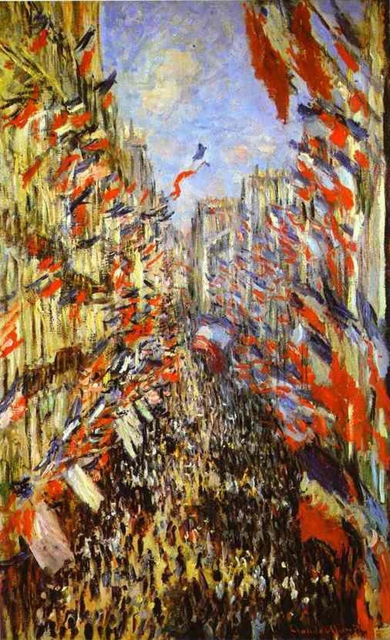
Claude Monet’s The Rue Montorgueil 


Option #1 Compare and Contrast...


For this weeks Blog I decided to write about option one, Compare and Contrast the two paintings by Monet and Manet. There are many things different within these two images, mostly on subject matter and only slightly on technique. however there are also a lot of things these two paintings have in common.
For example, in Manet's interpretation of the fair, the streets are practically empty, aside from only a few pedestrians. there are flags adorning the buildings however its mostly bare, and there is a lot of empty space. it doesnt seem like this fair is very popular, or rather, it seems as if the fair is over, or hasn't started yet. where as in Monet's painting the street is packed with people, so much so that its hard to see the ground. Along with this factor there are hundreds of flags everywhere, there seems to be naught a spot where the building is bare. this is what I think of when I think of a fair in this time period. Another thing different about these two images is that Claude Monet's depiction of the fair is as if he is floating high over head looking down, or in a building. far off in the distance buildings tower upwards into the light blue sky, and there is a sense of crowding going on even in the negative spaces in this image. On the other hand Manet's depiction of the fair is from a slightly higher angle, such as a second story window, or on the top of a sudden hill looking down a long street. There is no sky in Manet's painting, however we get a sense of how nice of a day it is by the shadows and light cast onto the ground and the flags in the foreground. Manet's image suggests to the viewer that he attended the fair (or what is left of it) while Monet's depiction makes it seem like he is above the fair, not willing to participate. 
As for what these two images have in common, they both are obvious depictions of the fair, they both have many of the same elements, and they are both painted in a impressionistic style. they were both painted outside, and they both have the element of spontaneity of a time in the day. Monet more than Manet, however since he literally has a flag being blown in the wind above the festival while Manet only has carriages waiting to pick up or drop off the people for the fair. also both of these paintings are painted with what appears to be quick brush strokes, nothing seems to be blended too much with the colors around it, and there isn't any small details such as facial features of the people on the ground, or writing on the buildings. 
Both of these paintings represent a major element that has yet to be discussed in this blog; they are both avant-gaurdeist paintings. they both depict a modern france after the war, and they both have a very un-salon worthy style of extreme amounts of unmixed color and no smooth brush strokes. they are both worthy of being called avant-garde paintings however because of these elements and more. 
all in all, both paintings are beautiful representations of the Rue Montorgueil and the Rue Mosnier, and are both a shining tribute to their home country of France. I believe both painters are very talented and that both of these paintings are very beautiful. However there were more differences between these two paintings than there were similarities and both would have been seen as sloppy or "impressionistic" in their time. 

Edouard Manet’s The Rue Mosnier with Flags

Wednesday, April 11, 2012

Mother and Child, Mary Cassatt


Mother and Child
Mary Cassatt
1890


The figures that Mary Cassatt paints can be considered to be impressionistic, for many reasons; and can be compared to the greats such as Monet, Renoir, and Degas. I believe that Mary Cassatt was extremely successful when creating her impressionistic paintings because she follows all if not most of the rules for the impressionistic style. And on top of all that, she did it as an american in a foreign country.
For example, Mary Cassatt uses very heavy brushstrokes and a thicker application of paint when working on her canvas' and her colors dont always blend perfectly to help illustrate the fact that it was indeed painted and not photographed. Although her figures are very 3 dimensional (for the most part) her paintings are flat and layered. this is another component of impressionistic style art.
One thing that drew me to this artist was her subject choice of the mother's with their children. they all seem like a split second in the lives of these hard working mothers, and their rambunctious children. especially since some of these children were painted at such a young age, its hard to sit still for any given amount of time, let alone to pose for a painting! Thats a major heads up to the fact that this was painted with spontaneity and speed to get the right look of the child relaxing in his/her mother's arms.
The use of color in this painting is very soft and relaxing as well, and the rosy colors of the mothers dress couple together nicely with the pink of the child's cheeks. this same pink is also seen in the table cloth behind them, as well as in the shadows of the dress, and in the child's toes. I also really love how she painted the light blue wash bucket and pitcher each on either side of the mothers head. it balances out the pinks in the image nicely and can coincide with the childhood cliche colors of light pink and light blue. the sense we get of the light streaming in through the windows is also rather lovely, as its so subtle we barely notice it.  the slight highlights on the blue's as well as on the child's white shirt and a bit more on the mother's bodice of her dress.
 I believe that Mary Cassatt is equal to the greats of her time because she is able to take a simple snapshot portrait painting of a mother and child, and turn it into an impressionistic painting which is lovely in its own right. Monet and Renoir were masters with light and environments, as well as creating scenes with bright colors and intense brush strokes, but I truly believe that Mary Cassatt's work is equal in quality to both of them, because she was able to do all of this in a mans world; and still be successful. Its also really interesting to see how many different emotions she can evoke with the subject matter of a child with its mother; even to the point of empathizing with the painting, or even in some cases pulling the viewer into the art piece to the point where it is the viewers mother, or it is the viewers child. In these instances the viewers are invited to interact more with the paintings, and can make them easier to attract a following.
I mentioned earlier that this work illustrates almost all of the aspects for a impressionistic painting, however there are a few that arent represented. such as the Plein air, and it doesnt quite represent urbanized paris, but I truly believe that this painting takes the cake with all of the other aspects depicted; such as speed and thick brushstrokes, experimenting with light and color, and extreme realism to make it an instant one of my favorite paintings in this era.
 I also find it interesting that she was an american in paris, that still became successful with the style of art that was popular in paris at the time. No one in america at this point painted in an impressionistic style, so this to me is another reason why she is truly a impressionistic painter to be remembered along with the greats of her time.


Wednesday, April 4, 2012

Oppression is always Offensive


Post #2 
The Stone Breakers 


I believe that the reason Gustave Courbet's painting, "The Stone Breakers" is so realistic is because he painted without censoring what the Bourgeoisie class would turn their gaze away from. Bourgeoisie means wealthy or upper middle class people; it basically refers to the kind of people who never have to get their hands dirty to afford their next meal. However, by having so much money in that time period, when so many were suffering and working hard to survive, the  Bourgeoisie people did nothing to help. That may have been why this beautiful painting of two working men making ends meet was so disgracefully revolting for them to look at.  

That would require them to actually look at the suffering souls around them. 

The anonymity of these two men further illustrates their accusatory thoughts as they carried heavy baskets of rocks, or stooped over a pile of even more rocks to hammer away. you cant see their faces, but that doesnt stop the viewer from identifying with them. their clothes are dirty and ragged, torn and worn and yet the men in this picture feel no shame, because they are working their hardest for a chance to bring home some coin and feed their families. I think a similar comparison to a painting such as this in a culture, would be for someone to paint a large picture of a homeless man begging for money on the sidewalk. In reality people usually avoid their glances and keep walking, or even speed up their pace to get away from them. so how would it look for someone to paint this subject matter up close and in your face huge, and then enter it into the Salon next to historical and other popular styles of painting? It probably wouldnt go over too well, I'd imagine anyway. 

This painting had a similar response; although I see it for its simple beauty and talent of artistry, people were threatened and repulsed that an artist would dedicate such a large canvas painting to such lowly subject matter. I also believe that in a way Gustave Courbet elevated these two individuals to a higher level than some of the wealthy aristocratic Bourgeoisie people that had yet to receive a painting portrait of themselves. Could it truly be, that some of these people were so self centered and calloused from the world around them, that they couldnt even appreciate this painting for its simple beauty? the two men are obviously very lavishally painted with beautifully painted creases in their pants and shirts, dirt painted in to make it seem dirty, even the lines on the skin of the older man are insanely replicated and beautiful. But they didnt see any of it. all they saw was poverty and blame being pointed in their direction for it. 

I guess when you look at your own guilt, your eyes are already clouded with repulsion. 

The men in these images cant even look at the viewer, but then again they didnt have to. They were too busy working to turn around and acknowledge the artist and to take the time to have their identities recorded in history. But this is better I think, because it allows the viewer to blame themselves if they had any guilt, and to truly look at the pain and suffering of these people.